In this report MJW have looked at the returns from each of the major asset classes and explored the fortunes of three portfolios labelled Income, Balanced and Growth each with varying levels of exposure to growth assets. The period has seen some major movements in share markets during a period of consistent falling interest rates.
MJW look at the components of the return highlighting how the return on the income assets produces the regular consistent return favoured by many investors. As shown over the period, share investors have not been rewarded for the volatility of their returns.
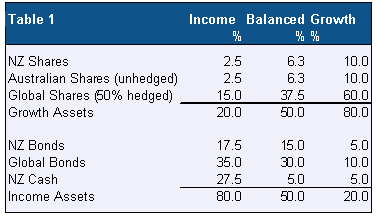
Portfolios
The model portfolios are shown in Table 1. The asset allocations are similar to the current KiwiSaver funds, albeit with more exposure to global assets and so give an indication of how the contributions invested by current KiwiSaver members would have fared if the scheme had been introduced back in January 1993.
The bond portfolios show a consistent bias to global bonds over NZ bonds which will have boosted the returns to investors. The asset allocation reflects MJW's current portfolio thinking. In contrast going back to June 1997 the AMP “A” unit, a balanced fund, had just 2% in global bonds. These changes are explore later in Chart 6.
Looking back 20 years
During the 20 year time period to December 2012 we have witnessed:
To provide some reference points we have compared some indexes then and now in Table 2.
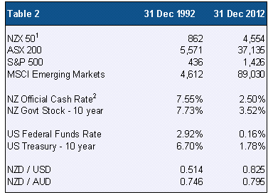
Note: The NZX 50, ASX 200 and MSCI indices include the return on dividends while the S&P 500 does not.
1 The NZX 50 only goes back to 2003 and so prior to then we used its predecessor, the NZSE 40.
2 The Official Cash Rate was introduced in 1999 and so we have shown the level of the overnight interbank cash rate at 30/12/92.
Individual sector returns
Table 3 shows the results for the individual asset classes over the 20 year period.
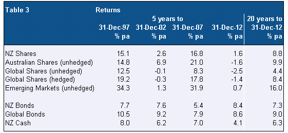
Commenting on the figures:
Below we show the results with a risk return chart illustrating the variability of each sectors’ results.
Chart 1
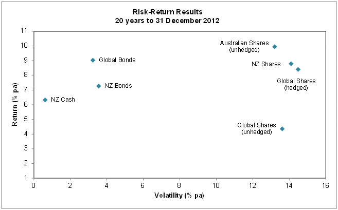
Commenting on the results:
Cumulative return
Chart 2 illustrates the cumulative returns over the period for the three portfolios.
Chart 2
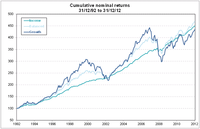
Commenting on the results:
Separating out the returns from growth and income assets
The income and growth assets have very different characteristics. The income assets are there to provide steady annual returns with some certainty of preserving the capital invested. In contrast the growth assets are expected over time to produce the greater returns to compensate for the regular fluctuations of the returns. Put simply the investors in growth assets need the additional return if they are going to take the additional risks involved.
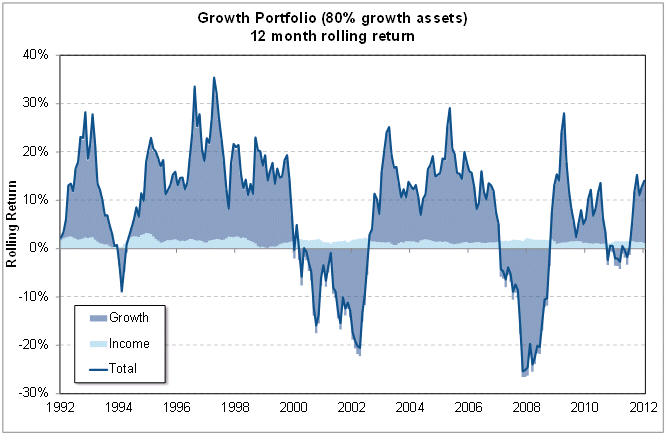
The following three charts illustrate the contribution made by the income and growth assets over the period to the total return of each portfolio.
Chart 3
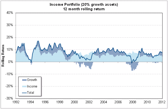
Chart 4
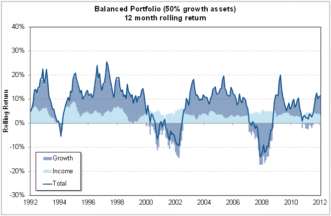
Chart 5
Commenting on the results:
Income portfolio
The light blue area is fairly steady over the period with the exception of 1994 and 2000 when interest rates rose and the fall in the capital value of the bonds reduced the total return from income assets. But, except for late 2008, the overall return on the portfolio has always been positive. The return on the shares component of the portfolio in contrast has been very variable but the limited exposure to this sector has limited the overall impact on the total return.
Growth portfolio
The overall return is dominated by the return on the growth assets with the income assets providing just a small cushion to reduce the losses in 1994 and 2000 to 2003 and the 2008/09 period.
Balanced portfolio
The results are naturally a combination of the lows and highs of the other two portfolios.
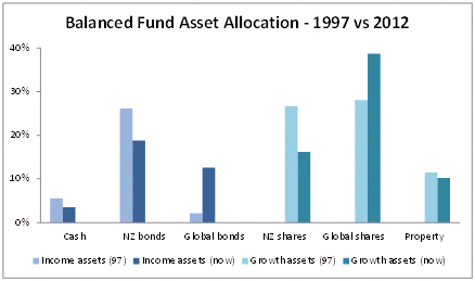
Changes in asset allocation over 15 years
Chart 6 illustrates how for a typical balanced fund the asset allocation has changed over the last 15 years. The fund illustrated for 1997 is the AMP “A” unit and for 2012 we have taken the AMP KiwiSaver balanced fund. The major changes for 2012 are increased exposure to global assets both bonds and shares. Back in 1997 the exposure to global bonds was minimal while for shares, global and NZ had almost identical allocations. Clearly the increase in global exposure makes the decision on currency exposure of prime importance.
Chart 6
Conclusions
Looking at the results for the 3 portfolios we note:
Perhaps the only clear conclusion to reach from the analysis is that investors will need to lower the investment returns they expect in the future and manage to this new normal accordingly. A year ago we were needing to start thinking more in terms of the lower returns going forward, come the end of 2012 accepting the lower returns now seems to be a given.
| « Harbour Monthly Commentary: Stronger global growth signals | Hamish Douglass Unplugged - Latest Video from Adviser Briefing - August 2012 » |
Special Offers

© Copyright 1997-2026 Tarawera Publishing Ltd. All Rights Reserved