KiwiSaver fees under the spotlight

[With graphs] Fees KiwiSaver managers are charging fund members are starting to come under scrutiny now providers are required to make quarterly disclosures.

Thursday, August 14th 2014, 6:00AM 10 Comments

Currently there is $21.4 billion invested by 2.3 million members in KiwiSaver and because of its size and importance to financial markets is getting more attention from the regulator.

FMA head of supervision Kirsty Campbell says that 66% of members are in bank run schemes and these schemes are seeing strong growth in funds under management and in membership, especially compared to non-bank schemes.

She can "see why there are concerns about switching practices."

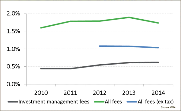
The regulator's analysis of the March quarterly disclosure documents show that investment management fees have been rising and this may be because of performance fees, however overall fees have shown a slight fall.

[Article continues below]

KiwiSaver management fees increasing


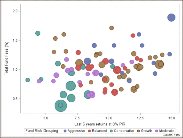
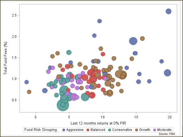
Campbell says the FMA has done some analysis of fees and the following two graphs show there are some outliers. (The circles are coloured to illustrate fund risk profile and each circle's size represents the size of the fund).

"Some are being followed up to see if there is a reasonable explanation (why fees are high)," she says.

GRAPH: Fees and five year returns

GRAPH: Fees and 12 month returns

« Advisers to do AML due diligence for fund managersIFA working on pro-bono offering »

Special Offers

Comments from our readers

On 15 August 2014 at 8:08 am Pragmatic said:
You get what you pay for...
On 15 August 2014 at 9:24 am John Berry said:
actually Pragmatic if you look at the graphs I think you will find they show the opposite of the tired old "get what you pay for" mantra. At every return point over 1 and 5 years there is a fee variation of between 50 bps and 150 bps. You can pay lower fees and get the same or often better returns. Higher fees do not mean better investor outcomes.
On 15 August 2014 at 9:34 am brent sheather said:
Good work by the FMA !
On 15 August 2014 at 9:52 am Brent Sheather said:
Re: Pragmatics’ comment that “you get what you pay for” … the reality is that you actually don’t get what you pay for because what you pay goes to somebody else. Research by various academics shows that the higher the fee the lower the return. This relates to standard fees, not performance fees obviously.

Incidentally in the last 12 months, the Financial Times reports, that low cost funds ie ETF’s have attracted huge amounts of new funds which used to go to higher cost funds. Investors are waking up. I think Philip Coggan in his Buttonwood column in the Economist touched on this recently too. Best practice is to have some active managers and some passive. Regards Brent
On 15 August 2014 at 10:27 am Andrew Parkinson said:
It appears to me that on the evidence presented in the 5 year returns graph. The dot in the top right corner is by a substantial margin the highest fees and the highest return by a smidgen. Every single dot below that point shows lower fees and LOWER returns.

There are a few nearly as good returns at much lower fees but there are also an awful lot of MUCH lower returns at lower fees.

It is return after fees that counts. I'll take over 15% return over 5 years paying 2% over a 10% return paying 1% in fees every time.

Whenever you pay for something what you pay goes to somebody else, that's what "paying for" means.

That being said there are certainly some managers charging high fees for dismal performance.

Who is that conservative fund top left corner?
On 15 August 2014 at 10:49 am Dai said:
Is there a link to the FMA review please?
On 15 August 2014 at 10:51 am The Editor said:
@Dai. The presentation didn't have much information attached with it.
We have asked for more information but are still waiting for a response.
On 15 August 2014 at 12:18 pm John Berry said:
Andrew you are right that the highest performing aggressive fund is ahead by "a smidgen" and charges the highest fees. That is also true of the highest performing growth and moderate (but not balanced or conservative) funds.

However not every investor is in the top performing fund so rather than picking an extreme example I'd prefer to look at the overall picture.

If higher fees deliver higher returns then you'd expect the distribution to resemble an upward sloping line for each risk grouping, which it doesn't.
On 15 August 2014 at 12:30 pm Pragmatic said:
Apologies John Berry - I should have been more exact with my previous statement

You do get what you pay for - although to be fair there is an aweful lot of "noise" out there. Part of the solution is having a screen/research/ability in place to filter out those capabilities that simply don't justify their fees

Specifically: too many advisors are being lured into passive/quasi-passive strategies & being charged active fees. I tend to agree with the likes of Brent Sheather, whereby the defining argument for investing in passive strategies continues to be the price you pay
On 19 August 2014 at 10:14 am Ellie Broderick said:
One assumes the returns after fees?

I'd like to see a benchmark passive return added relative to risk to see by what margin the fund has added return relative to fee.

"You get what you pay for" misses the point on so many levels.

The 5 year chart just seems to confirm what we already know - return is relative to risk, fees are not a great indicator of the value that a manager will add, and the underlying asset mix is related to fees; i.e. the more volatile the asset return is the more management fee is charged. What isn't answered is why and if this charge is justified against a passive portfolio.

Given the dispersion of some fund types, it also indicates that the broad terms used in the industry are still not adequately defined.

I'd like to see an after fees and tax return against unit of risk taken.

Sign In to add your comment

www.GoodReturns.co.nz

© Copyright 1997-2024 Tarawera Publishing Ltd. All Rights Reserved