The quick approach to price comparison on life insurance is both entirely understandable, and dumb.
Wednesday, September 10th 2014, 11:05AM
by Russell Hutchinson
“Everybody” who wants to quickly compare the pricing or product from one company with another does a quick quote on a male, non-smoker, age 40, for $500,000 life cover. If we are investigating Income Protection cover they proceed to add: class 1, 4 week wait, and to age 65 benefit.
Having a simplest scenario to quote on makes some sense. Except since it gets quoted all the time it is the price insurers most like to target when doing comparisons.
Most workshops, launches, and company-issued comparison material will include this comparison point, and maybe one or two others.
But another argument can be made: The population last June was estimated to be about 4.5 million. Slightly more than half are female, so our scenario chucks out about 2.3 million women. Next it eliminates about 655,000 smokers.
Finally by picking people who are age 40 (even if we count a five year age band of 40-45) we eliminate another 1.47 million people and arrive at a group which contains just 113,557 people or 2.52% of the population. Note we haven’t even considered more complex situations like income protection.
That would still be fine, if the age 40, male non-smoker rate were a reliable proxy for the position we can expect to find that company’s rates at all the other ages, genders, and smoking statuses. The problem is that company positions change a lot depending on the scenario.
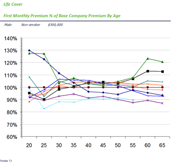
Consider figure 1, this shows the actual premiums for every major adviser-focused provider (plus a couple of direct ones too) shown as a proportion of Fidelity Life’s premium (the flat line in the middle – I chose them because they were about the middle of the pack for age 40).
At age 40 all the rates are very close together: 15% covers the most expensive and least expensive company amongst main insurers. You can see how it spreads out at younger and older ages – not too much, but a bit. But even so, one company goes from worst, to third, just by changing the age of the application from 30 to 40. That’s why we refer to the shape of this chart a ‘pinch point’ or ‘bow tie’.
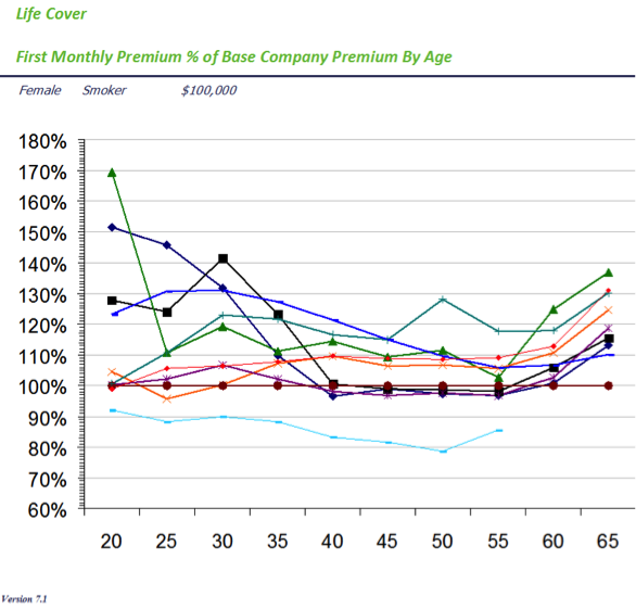
But now change the basis to a female smoker after $100,000 cover.
This is shown in figure 2.
The difference between best and worst cost is a minimum of 35% and a maximum of about 75%. A big difference in cost.
That’s just life cover, the situation with income protection is even more variable.
What it means is that you cannot assume that what you see in terms of competitive position at one point is the same at another. In fact, it is far safer to assume the opposite, and therefore check. It means you have to check again after you have found out that they client’s occupation class is actually two instead of one. It means you have to check again when you find out their age.
It means you have to check for each of the clients you are advising.

 Consider figure 1, this shows the actual premiums for every major adviser-focused provider (plus a couple of direct ones too) shown as a proportion of Fidelity Life’s premium (the flat line in the middle – I chose them because they were about the middle of the pack for age 40).